
How Your Website Design, Messaging, and User Experience Are Building—or Breaking—Patient Trust
It is a fact that your healthcare website is more than just an online brochure—it’s often a patient’s first impression of your brand. Before they ever step foot in your office, they’re judging your professionalism, experience, values, and trustworthiness based on what they see (and feel) online.
Whether you’re a private practice, a medical startup, or a wellness-focused brand, your website is quietly communicating critical messages to your audience—messages that influence whether a patient books an appointment or bounces to a competitor.
In this article, we’ll break down what your website might be saying to patients (without you realizing it), the subtle ways it impacts trust, credibility, and patient experience, and what you can do to make sure it’s speaking the right language.
“Your Website Is Speaking, Even If You’re Not” – Karee Laing
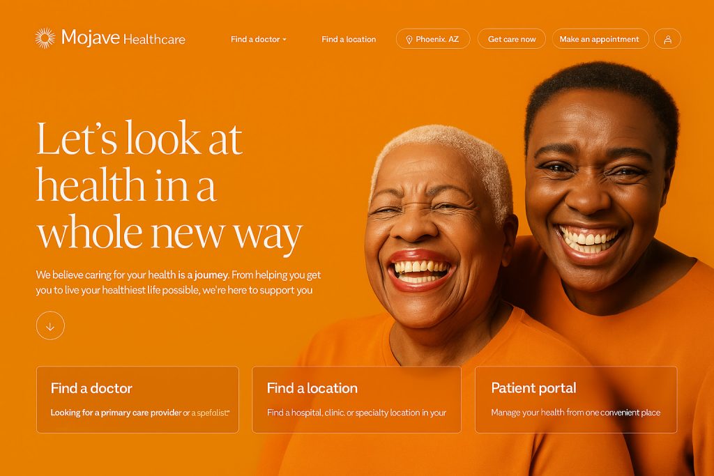
1. “You Can’t Trust Us” – When Your Website Looks Outdated or Unprofessional
An old, cluttered, or poorly designed site sends the wrong message: we’re not up to date, and maybe our care isn’t either.
Why this matters: Patients expect the same level of quality online as they do in your office. A website that looks dated can undermine trust—even if your clinical care is top-notch.
Red Flags:
- Outdated design or broken links
- Slow loading times
- Non-mobile-friendly layout
- Stock imagery instead of real staff or patient experiences
What to Do:
- Invest in a modern, mobile-optimized website.
- Use real photos of your team, office, and patients (with consent).
- Ensure fast load times and secure (SSL-certified) browsing.
Example: A pediatric clinic with a warm, welcoming color palette, clear navigation, and real images of staff builds immediate trust with young families.

2. “We Don’t Understand You” – When Messaging Misses the Mark
Your website copy isn’t just filler—it’s your digital bedside manner. Poorly written or overly technical content tells patients: we’re not speaking your language.
Why this matters: Healthcare is personal. If your content doesn’t feel empathetic or aligned with patient concerns, they’ll look elsewhere.
Red Flags:
- Overuse of medical jargon without explanations
- No clear benefit-driven messaging
- Missing or vague calls to action (CTAs)
What to Do:
- Write with empathy. Focus on how you help and why it matters to the patient.
- Use plain language, not just clinical terms.
- Place clear CTAs like “Book a Consultation” or “Meet Our Doctors” throughout your site.
Example: Instead of “Cardiovascular Consultations Available,” try “Worried About Your Heart Health? Book a Checkup With Our Heart Specialists Today.”

3. “We’re Hard to Work With” – When Navigation is Confusing or Booking Is Difficult
If patients struggle to find information or schedule an appointment, your website is telling them: working with us might be a hassle.
Why this matters: Convenience is a key factor in patient decision-making. A confusing site creates friction and frustration, lowering the chance of conversion.
Red Flags:
- No clear appointment booking system
- Overwhelming menus or hard-to-find contact info
- No patient portal or digital form access
What to Do:
- Simplify navigation with 5–7 core menu items.
- Add sticky or prominent CTAs like “Schedule Now” or “Call Us Today.”
- Integrate an online booking tool or patient portal.
Example: A dermatology practice that enables patients to book online, check insurance eligibility, and fill forms ahead of time sees higher appointment retention.
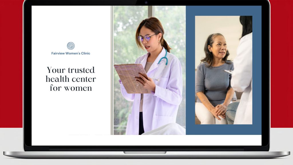
4. “We’re Just Like Everyone Else” – When Branding Is Generic or Missing
If your site looks like every other practice in your field, you’re missing a massive opportunity to differentiate. Your website should say: this is who we are—and here’s why you should choose us.
Why this matters: Patients want to feel a connection. A clear brand identity helps them understand your values, style of care, and what makes you unique.
Red Flags:
- Generic stock images and templated content
- No mission, story, or value proposition
- Inconsistent colors, fonts, or messaging
What to Do:
- Share your origin story and mission upfront.
- Infuse your brand colors, tone, and values consistently.
- Highlight specialties, outcomes, or philosophies that set you apart.
Example: A wellness brand with a calming design, inclusive language, and a message centered on holistic care can immediately resonate with its target audience.

5.“We Don’t Have Time for You” – When There’s No Patient-Focused Content
If your website is all about your services and not the patient experience, the message is: this is about us, not you.
Why this matters: Patients are looking for information, reassurance, and a sense of care—even before they visit. Providing value upfront builds trust and credibility.
Red Flags:
- No blog, FAQs, or educational resources
- Lack of testimonials or case studies
- No patient success stories or community involvement highlights
What to Do:
- Add a blog or resource section with relevant health topics.
- Share testimonials, patient spotlights, or video interviews.
- Highlight your community outreach or patient programs.
Example: A family medicine clinic sharing seasonal health tips, school physical reminders, and vaccination guides positions itself as a trusted local resource.
About Brand MD
Brand MD is a strategic branding and digital marketing agency dedicated exclusively to healthcare and wellness organizations. We help medical brands define who they are, connect with the right patients, and stand out in a competitive market. From custom website design and content strategy to SEO, reputation management, and full brand development, we’re your partner in building a brand that patients trust—online and off.